Unveiling the Institute’s new brand
The age of data is the age of the actuary.
Now is the opportune time for us to evolve our visual identity to reflect our core areas as well as the growing diversity of members, and those growth areas where actuaries are making a strong impact.
We are excited to launch the new brand today, which reflects our members, half of whom are aged under 35 and 20% of whom are based overseas. The new brand also seeks to capture members within growth areas, such as data science and climate risk, and visually communicate that social purpose is in our DNA.
“This was the perfect opportunity to create a fresh Actuaries Institute brand identity that reflects the modern and future-focused actuary. We need it to appeal to the full range of our stakeholders, from students considering a career in maths/data, graduates, the most senior actuaries, and future employers of actuaries. The new brand needs to be simple, clean and future-proof.” – Naomi Edwards, President of Actuaries Institute.
Our new brand is evolving from:
To:
![]()
“The Actuaries Institute has been here for 125 years, a lot longer than any of us, and it’s going to be here a long time after us, so we are custodians. You have to respect the foundations and history of the brand while reflecting the future of where the profession is moving. We have retained the blue to leverage our existing brand equity while modernising the tone as we take a digital-first approach.” – Elayne Grace, CEO of Actuaries Institute.
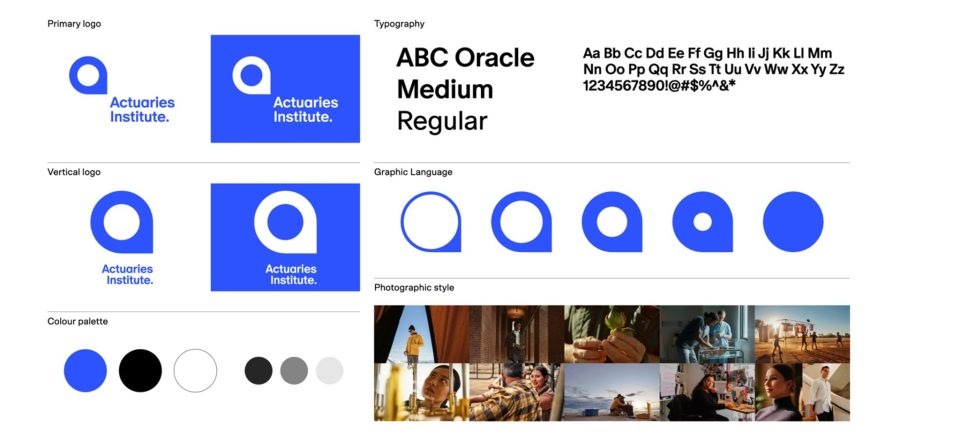
The graphic language – the ‘Human impact’
The way the brand will be represented visually celebrates the difference actuaries make in the world through genuine human stories. It also represents actuaries’ unique processes and brilliant thinking to create clarity for the future. This will help communicate the actuarial difference to the broader public and appeal to the next generation who are seeking ESG career paths.
The brand in use
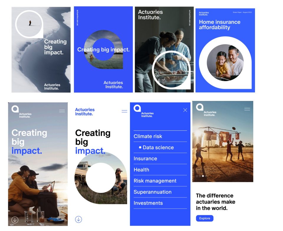
The viewfinder
The new Actuaries Institute symbol is a viewfinder, representing the actuarial mindset and capability to unlock data by harnessing insights from complex information and finding the most valuable outcomes. The viewfinder will be shown over imagery to hone in on certain viewpoints as a visual communication tool.
The symbol also represents a lowercase ‘a’ for actuaries. The full stop at the end of the logo represents the finding from within the viewfinder and mimics the negative space within the shape.

Photographic style
The Actuaries Institute’s photographic style for human impact stories will reflect the difference actuaries make in the world through genuine human stories, emotionally connecting with our audiences.
We want to capture the stories and lifestyle of the people our work affects and show the impact actuaries make on broader business and society.

Toolkit
The new brand roll-out
Our website and email signatures will change almost immediately, along with all new content we produce. The rest of the roll-out will be phased, and our education material will be aligned with the start of Semester 1 in 2024 as the task of reskinning 25,000 pages of textbooks begins.
It has been a very exciting project to work on, with many members and stakeholders involved. Thank you to everyone who has contributed!
We are excited about the new brand and how it projects the amazing impact that actuaries contribute to the world. We look forward to showcasing real member stories, their passion, and their expertise to inspire those who engage with actuaries, and those who want to become part of this wonderful community.
CPD: Actuaries Institute Members can claim two CPD points for every hour of reading articles on Actuaries Digital.