A Data Scientist’s guide to Data Architecture
Zeming Yu unpacks what you need to know to build a robust data process.
When I once asked a senior executive in the AI space on data, his view on data was:
“You should always prepare your own data.”
He is not the only one thinking this way. The head of the department during my first job couldn’t trust another team to build the data pipeline and ended up writing a big portion of the ETL (extract, transform, load) code himself and had the data team reporting to him directly.
Why do these senior executives put so much emphasis on data?
Because without a good grasp of data, you won’t (and shouldn’t) have much confidence in the insights and recommendations that you derive from the data.
For data to move from its raw form all the way to being ready for analysis, it’s gone through a lot of processes. A good data scientist must question every step of the process relentlessly, and ask questions like:
- Is the right data collected?
- What’s the data quality like?
- What’s the end-to-end data process?
The purpose of this article is to go through some data architecture related topics using real-world examples so that you have some basic context and know what questions to ask your data team.
Part 1 — A case study based on a major insurer
Production vs staging
As mentioned before, I started my career working for a major insurance company, in a team where all data processes were done by ourselves.
Every month, we took a copy of a long list of tables from the production database and put it onto our SQL server which we called the staging database. The use of a staging database ensured we did not interfere with business operations (which can happen!). It also ensured the reproducibility of an analysis.
Production database: this is the transaction database used by various departments to administer insurance policies and claims in real time.
Staging database: this is a snapshot of the production database for dedicated analysis work. Monthly snapshots are common in practice.
Normalised vs denormalised tables
Once all the tables were copied onto the staging database, we performed a series of data processing steps to turn these into a handful of ‘denormalized’ tables. Raw data in a relational database are often normalized, which means information is split across tables to improve efficiency, integrity and dependencies, likable via primary and foreign keys.
For analytics purposes, a large number of table joins are required before you can have something useful for direct modelling.
For example, for predicting the probability of having a building insurance claim given the characteristics of the building you need a flat table where:
- The target is a yes/no flag indicating whether there was a claim or not
- The features/predictors are things like sum insured, age of the building, suburb, etc.
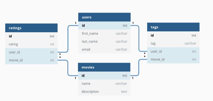
To create the flat table you need to join the claim table (which tells you whether or not there is a claim), the policy table (which has the policy information) and the risk table (which has the building information) together.
This process is called denormalization. The result is a denormalized or flat table where the data is well organized and ready to be analyzed.
You may think that denormalization sounds straightforward, but there are significant potential pitfalls. You may have duplicated records. You may unintentionally gain or lose records. So it is important to develop good habits. I was taught these when I started my first job, and I believe I still benefit from these good habits today:
- Before each join, check the uniqueness of the by variable.
- Check the type of join. Are we doing a left join, right join, inner join or outer/cartesian join?
- How many records did we start with and how many did we gain/lose at every step?
Mistakes at this stage of the data preparation will waste time down the track. This is a lesson I learned again and again in many different projects.
Delivering the core datasets
After a lot of efforts, we produced a few core tables that drive most needs for the team, which include:
- Policy header file: one row per policy showing the latest information about the policy
- Risk header file: one row per risk showing the latest information about the risk (e.g. a building or a car). There might be multiple risks under each policy.
- Claim header file: one row per claim showing the latest information about each claim.
These are all monthly flat tables stored on a common server. A new analysis started with making a copy of these flat tables, knowing that the data could be trusted.
Data integrity checks
Throughout the entire process, we had robust data checks at every step:
- When copying the data from the production database to the staging database, we reconciled the total record count and dollar amounts.
- At every stage of the transformation, we kept track of how much data is flowing into different outputs (records retained and those discarded, if any).
- We reconciled the premium, claim payments and case estimates from the core datasets against the general ledger provided by the finance department. Large deviations were investigated.
- We compared against the previous month to detect any significant movements.
- We used dashboards to detect any abnormal distribution changes.
At that time most of the data integrity checks and the ETL process itself were written in SAS programs. The code for the checking stage was usually significantly longer than the main code!
Understanding how the data is created
In addition to robust data checks, we also spent a lot of time learning how data was actually generated.
We did this by sitting with the people who spent their day inputting the data. In our case, it was the sales department for policy data and claims department for claims data.
We sat alongside the frontline staff, listening to them answer customer’s questions, typing data into the system. We tried our best to understand how they did their job and built a good deal of domain expertise. Building domain knowledge is always important; check out this article I wrote on that subject.
Data quality feedback loop
While the above process might be good for detecting data quality problems, it doesn’t fix them going forward. A feedback loop is needed to continuously improve the data.
Every month, we published a set of data quality reports and shared them with the management team. They would comment on issues such as poor address information, or incorrect dates of birth.
Data quality was KPI for staff and formed part of the metrics that affected their remuneration. This provides a powerful incentive for everyone to care about data quality.
This would never be possible without the support of senior management of the company. I believe a data-driven decision-making culture can never be driven from bottom up; it needs to come from the top down.
Part 2 — The new kid on the block
So far, I have explained a traditional approach, based on SAS. The terms ‘data engineer’ or ‘data scientist’ were not commonly used. Nowadays, a lot has changed, but most of the core concepts are still relevant.
Next, I will discuss a few topics that became increasingly relevant in recent years.
Internal vs external data
The data extracted from the IT system is called ‘internal’ data because it is internally generated.
External data is powerful and can significantly enrich and complement internal data. The type of external data varies significantly by context.
In the case of building insurance, some examples of useful external data are:
- Census data on demographic information for each area
- Police data on crime rates
- Building information
- Satellite images and high-resolution aerial maps
- National flood maps
- Weather data.
Motor insurance might include external data such as vehicle information or even driver telematics data.
Structured vs unstructured data
The data discussed above is primarily structured data. Unstructured data is information that is harder to directly plug into a predictive model, but still may hold important information. Examples of unstructured data include:
- Claims descriptions — using natural language processing we can derive features like the sentiment of the customer
- Satellite images — using image recognition, we can derive features like the existence of a swimming pool
Unstructured data typically require additional preprocessing before being incorporated into a standard model such as an insurance risk model.
Real-time analytics
So far I have only discussed batch processing, in this case performing analysis on monthly snapshots. The ETL process itself takes at least 2–3 days. Adding another few days for analysis, outputs would often take at least a week after the data becomes available.
Real-time analytics is different where new data points enter the analysis pipeline as soon as they arrive. In some industries this is commonplace. Amazon recommendation are instant; they don’t take a week to recommend their next product! Real-time analytics allows them to generate 35% of their revenue on Amazon.com from recommendations.
Real-time analytics is often within the realms of data engineers and can make results much more relevant. For example, consider dashboards related to the COVID-19 pandemic. I created a series of static dashboards. These were a pain to update and by the time I publish these articles, the numbers were already out of date:
Status Update of the Coronavirus (COVID-19) Outbreak — published Mar 17
Status Update of the Coronavirus (COVID-19) Outbreak — published Feb 29
Coronavirus outbreak — 5 questions to ask big data — published Feb 1
Compare the above to this interactive dashboard which shows the spread of the COVID-19 virus around the world and in particular in Singapore since late January. The entire process happens automatically as new data comes in. This is much more useful for the public and health officials alike.
Let’s apply the same logic to the insurance sector. Why should the CEO of an insurance company care about the sales volume or loss ratios from 3 months ago? Yet, today most insurance companies still consume monthly or quarterly reports.
With some exceptions such as real-time fraud analysis, the insurance industry tends to be slow to adopt these new technologies. As tools like R-Shiny and Dash make it much easier and more affordable to deploy real-time analytics I expect it to gain momentum in the near future.
Conclusion
Within the data science world, there are a lot of sexy topics that receive a lot of attention (deep learning, AI etc). Data architecture is not one of these sexy topics. Company executives won’t ever attract media attention by saying “we have built a world-class data integrity check”. But it is hard work that takes a lot of discipline to get it right. But if you do manage to get it right, it will probably deliver more value than any of those sexy topics.
As a data scientist, it pays to spend some time learning about data architecture concepts so that you can communicate effectively with your data team and ensure you have a robust data process that lays down a solid foundation for all your analytics work.
‘A Data Scientist’s guide to Data Architecture’ was originally published on Towards Data Science on 11 April 2020. Click here to read the original article.
CPD: Actuaries Institute Members can claim two CPD points for every hour of reading articles on Actuaries Digital.