Coronavirus outbreak — five questions to ask big data
Let’s explore the scale of the largest quarantine ever attempted in human history using big data. Zeming Yu uses the Baidu data platform to illustrate some interesting visualisations of movement due to the Coronavirus.
Update on 18 Feb 2020
This article was originally written on 31 January. Since then the scale of the outbreak has led to intensified measures to control the spread. For example, the residential community I live in has recently adopted closed-off management. I was given the entry permit below. Anyone who’s not registered is not allowed to enter.

The situation is similar for many cities across China. In some places, residents are given a quota to do their grocery shopping, e.g. once every two days. In Beijing and many other cities, people who arrive from outside the city need to observe a compulsory 14 day quarantine period. Schools have been closed, events canceled, and most companies are adopting a work from home policy.
Indeed, we are experiencing the largest quarantine ever attempted in human history! If you don’t believe it, just look at the graph below which shows the year on year comparison for the total traffic flow for the top 30 traffic hubs (airports and train stations) across China. Red is this year and green is last year.
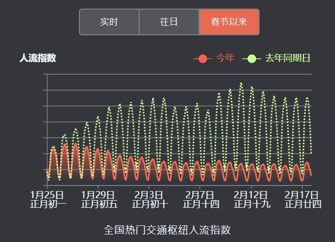
Let’s hope that such strong measures can effectively combat the spread of this highly contagious disease.
As I write this article, the total number of coronavirus cases on the Princess Diamond cruise ship has jumped to 454, highlighting the need for quarantine.
Original article published on 1 Feb 2020
Baidu map is used 120 billion times a day around the world. Based on so much geospatial data, Baidu launched this amazing data visualization platform called Baidu Qianxi (which means migrate). Together with the search engine data, Baidu really knows a lot about what’s happening.
The coronavirus outbreak and the resulting lockdown in Wuhan and surrounding cities have caused major disruption to people’s lives. What answers could Baidu provide us based on big data?
1.What’s the traffic like in Wuhan right now?
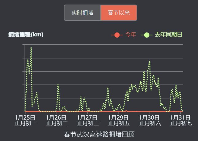
In Wuhan, the highway traffic jam distance, a measure of traffic activity, is down by 99.7% compared to the same period last year (red vs green line). The lockdown is real and ongoing.
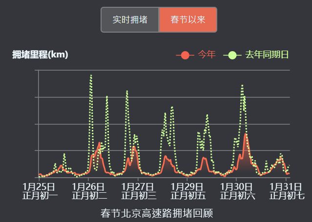
For comparison, here’s the same graph for Beijing – ‘only’ down by about 50%.
Traditionally, now is the time for people to come back to the big cities and start working. As we are still in the middle of this massive outbreak, there is a risk the traffic flow could further spread the virus.
The governments around China have either extended the public holiday or asked employers to arrange their staff to work from home. Could this be the year of “working from home” for China?
2. What’s the traffic like in Wuhan before and after the lockdown?
On 23 January, Wuhan suspended all public transportation from 10 a.m. onwards, including all bus, metro and ferry lines. Additionally, all outbound trains and flights were halted.
We can see from the graphs below that the traffic flow drastically reduced after the announcement on 23 January, but the traffic control wasn’t fully effective until 26 January.
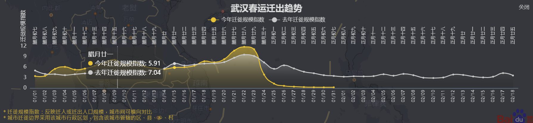
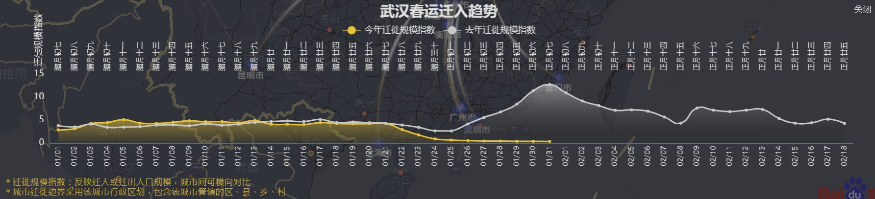
Again, now should be the peak time for inbound travel into Wuhan city after the Chinese New Year, but this year is very different.
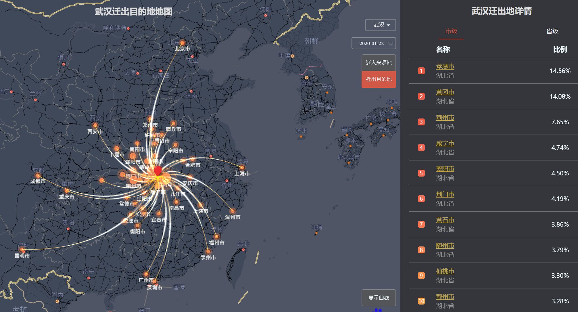
3. For those that left Wuhan just before the lockdown, where did they go?
The graph below shows that most of them went to other cities within the Hubei province. There’s no surprise that almost the entire Hubei province was under lockdown only a few days after Wuhan.
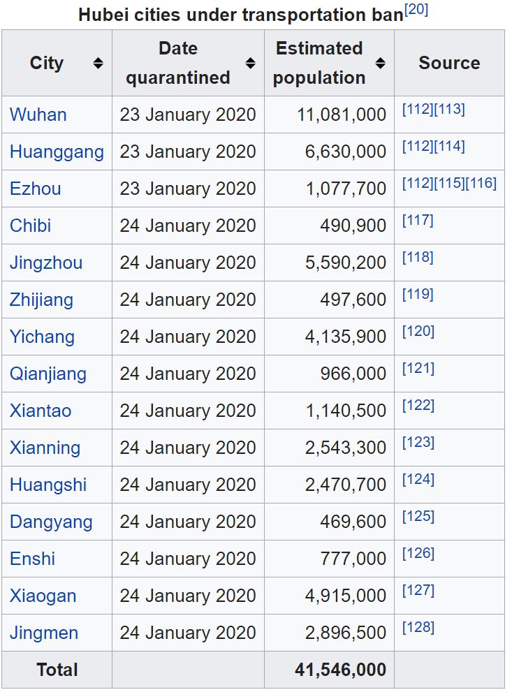
For reference, here’s a table from Wikipedia about the impact of the traffic ban:
4. What can we learn from Baidu search keyword trend?
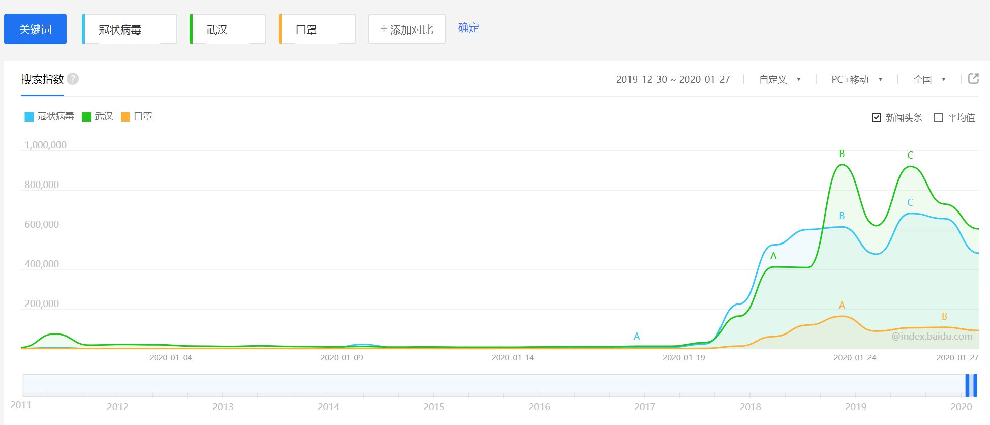
The number of searches for ‘coronavirus’ (green line) and ‘Wuhan’ (green line) took off around 19 January.
On 23 January, the number of searches for ‘Wuhan’ had another massive increase after the announcement of the traffic ban.
The increase in the number of searches for masks (orange line) increased slowly, driven by the fact that it was widely publicized that wearing the mask is one of the best measures people should take to avoid the spread of the virus.
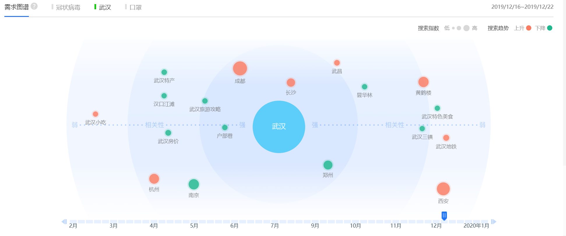
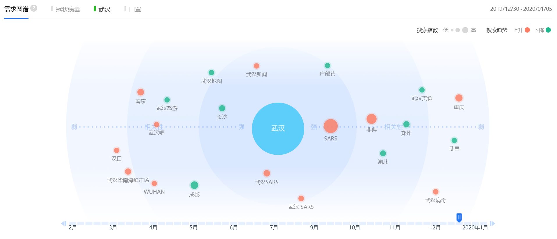
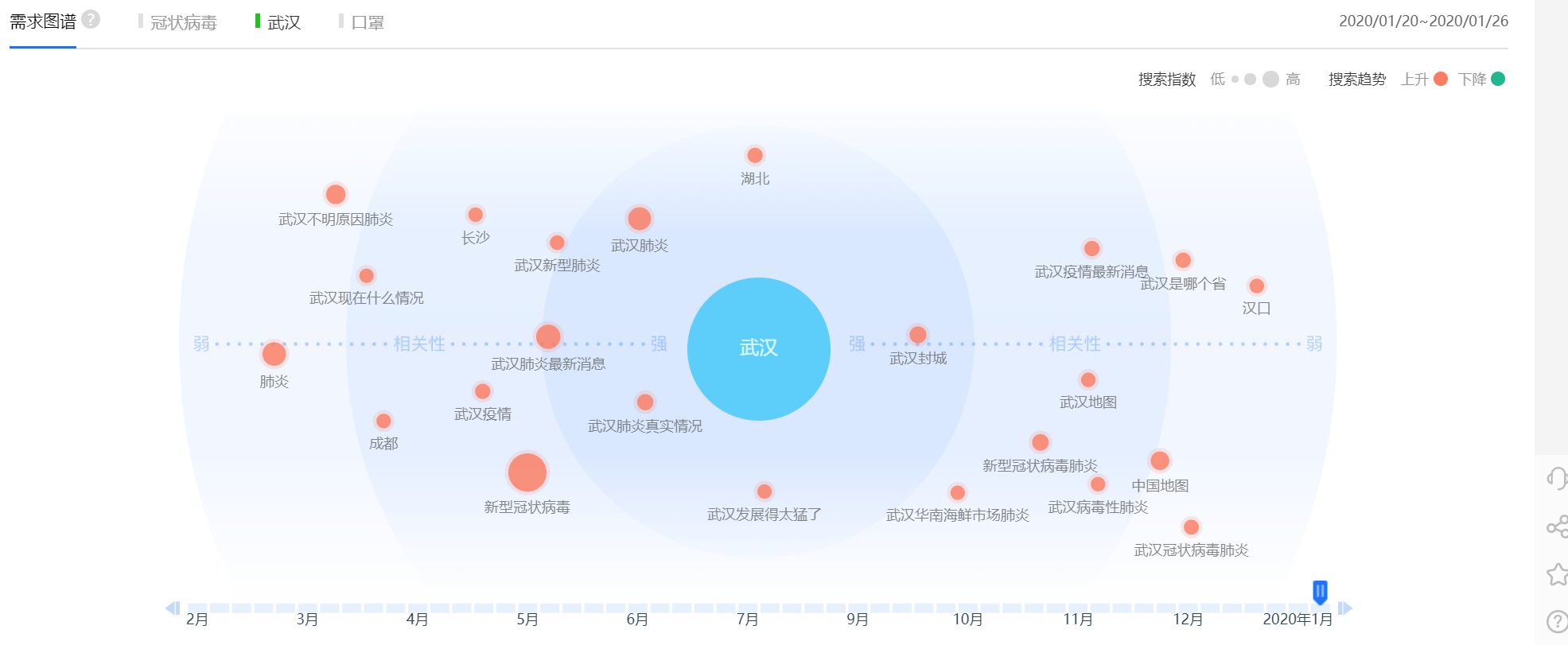
5. What’s the context of the keyword ‘Wuhan’ before and after the lockdown?
Baidu ‘needs graph’ shows the correlation of related keywords over time. As time changes the context of the keyword also changes. This provides us insights about what people were thinking at the time.
During December, ‘Wuhan’ tends to be correlated to other cities in China (e.g. Changsha, Chengdu) or favorite travel destinations within Wuhan (e.g. Hubuxiang, Wuhan’s famous breakfast alley) indicating tourism-related interests.
Two weeks later, the word ‘SARS’ appeared for the first time in the graph, probably because at that time people suspected about a SARS outbreak as they didn’t know what to call the new virus.
Fast forward to late January, some of the most correlated keywords are ‘Wuhan lockdown’, ‘Wuhan pneumonia’ and even ‘Huanan Seafood Market’ which is where most of the people got exposure to coronavirus in the early days of the outbreak.
In the age of big data, we can learn a lot about people’s travel patterns and search patterns using data providers like Baidu. All of this wasn’t available during the 2003 SARS outbreak. The extra data enables people to make more informed decisions this time and plays a pivotal role in the fight against the virus outbreak.
Tools used in the article
Baidu Qianxi is a big data product provided by Baidu which allows you to monitor real-time migration across China during the Chinese New Year.
Baidu keyword search and needs graph can be found in Baidu index.
Both tools are purely point-and-click. Just follow the link and select the relevant cities that you’d like to monitor. Unfortunately, there is no English version of these tools. If you need to do some research in this area and don’t know Chinese, maybe it’s a good idea to find someone who knows the language to assist you.
CPD: Actuaries Institute Members can claim two CPD points for every hour of reading articles on Actuaries Digital.