Analytics Snippet – Feature Importance and the SHAP approach to machine learning models
One of the biggest challenges in adopting machine learning models is their lack of interpretability. It is important to be able to understand what models are doing, and this is particularly the case for actuaries who solve problems in a business context. This article discusses the popular SHAP approach as a superior method of calculating feature importance.
Now that machine learning models have demonstrated their value in obtaining better predictions, significant research effort is being spent on ensuring that these models can also be understood. For example, last year’s Data Analytics Seminar showcased a range of recent developments in model interpretation. Today, I share some of my recent learnings and investigations with a frequently used model interpretation tool – the feature importance chart.
Feature Importance – and some shortcomings
The feature importance chart, which plots the relative importance of the top features in a model, is usually the first tool we think of for understanding a black-box model because it is simple yet powerful.
However, there are many ways of calculating the ‘importance’ of a feature. For tree-based models, some commonly used methods of measuring how important a feature is are:
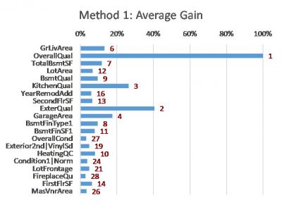
- Method 1: Average Gain – average improvement in model fit each time the feature is used in the trees (this is the default method applied if using XGBoost within sklearn)
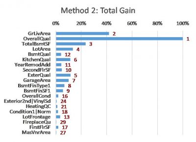
- Method 2: Total Gain – summing up the improvement in model fit each time the feature is used in the trees (also often implemented as default in machine learning algorithms)
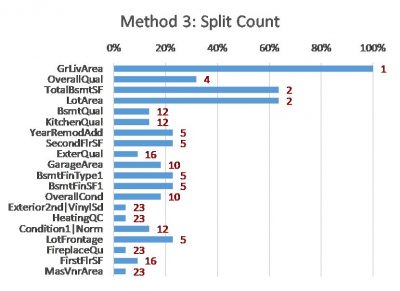
- Method 3: Split Count – counting how many times a feature is used to split the data in the trees
- Method 4: Drop Out Loss – calculating how much worse the model becomes if we remove (scramble) the information in the feature
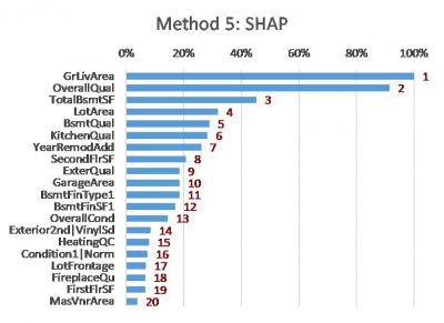
- Method 5: Shapley Additive Explanations (SHAP) – these measure the influence of a feature by comparing model predictions with and without the feature
The following charts show the results of these methods on a simple XGBoost model that I built using a free house price dataset from Kaggle [2]. The features are listed in the same order (as per Method 5) to allow easier comparison between the charts.
 |
 |
 |
|
 |
 |
Notes:
- The red values are the importance rankings of the features according to each method.
- Methods 1, 2 and 3 are calculated using the ‘gain’, ‘total_gain’ and ‘weight’ importance scores respectively from the XGBoost model.
- Method 4 is calculated using the permutation_importances function from the Python package rfpimp [6].
- Method 5 is calculated using the TreeExplainer function from the Python package shap [7].
The charts show that these methods can all produce different results. Although many differences are subtle, some are material. Even for the top three features (GrLivArea, OverallQual and TotalBsmtSF, from the SHAP method) the ordering and relative strength differs substantially. Intuition doesn’t help in this situation either – all of the top features (different measures of size and quality) are intuitively factors that can influence the price of a house.
The differences in feature importance results across the different methods raises some interesting questions. For example:
- Are there some biases or shortcomings within some methods?
- Which method is most suitable in my situation?
- Which method is most consistent with other model interpretation tools (e.g. partial dependence plots)?
- Is there one feature importance method which can be considered the ‘best’?
SHAP – a better measure of feature importance
One way of deciding which method is best is to define some sensible properties which ought to be satisfied, and then choosing the method(s) which satisfy them. This approach is taken by Lundberg and Lee [3] [4], who propose that feature importance attribution methods should have:
- Consistency – if a model is changed so that it relies more on a particular feature, then the method must not attribute less importance to that feature; and
- Accuracy – the total contribution of each feature must sum up to the total contribution in the whole model
Lundberg and Lee highlight that some commonly used feature importance approaches (including the two Gain methods) do not satisfy these properties. They also present SHAP as the only additive feature attribution method that satisfies these two properties based on results from game theory.
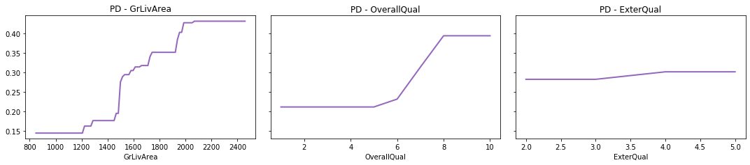
So how did SHAP fare in our example? Apart from the theoretical arguments above, when I inspected some other diagnostics (e.g. the three partial dependence plots below), I do tend to prefer the SHAP ranking. For instance:
- The ExterQual chart suggests that it only makes a minor contribution to prediction, however Average Gain (Method 1) places it as the second-most important variable. SHAP however relegates it more appropriately further down the list. This is due to the Average Gain method averaging the contribution of features across all instances they appear in the trees. This dilutes the calculated importance of (say) GrLivArea, which is used as a splitter many times although not always improving the model by a large amount each time it is used.
- The plots also suggest GrLivArea and OverallQual both make significant contributions to the prediction, with GrLivArea perhaps contributing slightly more as it produces predictions of a wider range and higher granularity, thus lending support to SHAP over Total Gain (Method 2). The different assessment provided by Total Gain is likely because it only considers one ordering of features – the original order in which they were added to the trees – which can lead to biases when there are interactions between the features (a simple illustrative example of this bias is provided in [5]).
More than just the standard feature importance chart
The shap package in Python [7] can be used to produce more than just the standard feature importance charts. Below are a couple of examples of additional outputs to aid interpretation, again based on the house price XGBoost model.
Example 1
The following enhanced feature importance chart shows both:
- The overall importance of features (a wider spread of SHAP values implies more differentiation in model output and therefore higher feature importance), and
- How the features tend to influence the model prediction (using colour – e.g. red denotes points with higher feature values, which generally tend to increase the model prediction in this particular model).
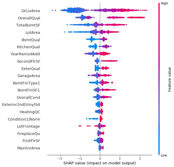
For example, some observations we can obtain from this chart are:
- There are a large number of houses with low GrLivArea (living area) which are all unlikely to have a high house price. However, for all houses with at least a moderate living area, the larger the living area the more likely it is to have a high price.
- Most houses have low to moderate OverallQual, and for these houses OverallQual only has a slight impact on the model prediction. However, once a house is rated very highly for its overall quality, the likelihood of a high price increases drastically.
Example 2
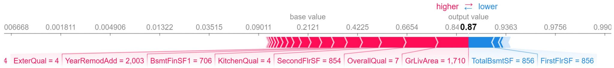
The following chart uses SHAP to provide a breakdown of the key drivers for one particular record in the data (i.e. a local explanation). The SHAP values for each feature represent their contribution towards a higher or lower final prediction. In this case we can see the prominent role of GrLivArea and OverallQual in driving the prediction higher for this observation.
Conclusion
Recent research has shown that SHAP is a consistent and accurate feature importance attribution method, and therefore arguably superior to a number of approaches commonly used today.
If you would like to read more on SHAP, you can refer to the two research papers in the references below, or this article [5] for a less technical explanation.
References
- “Model interpretation & explanation”, a presentation by Josh Jaroudy at the 2018 Data Analytics Seminar
https://actuaries.logicaldoc.cloud/download-ticket?ticketId=88dc3a68-095f-4b4c-90a2-b308fa487146 - Kaggle – House Prices: Advanced Regression Techniques
https://www.kaggle.com/c/house-prices-advanced-regression-techniques - Lundberg, S. and Lee, S. (2017) “A Unified Approach to Interpreting Model Predictions”
https://arxiv.org/pdf/1705.07874.pdf - Lundberg, S. and Lee, S. (2018) “Consistent feature attribution for tree ensembles”
https://arxiv.org/pdf/1706.06060.pdf - “Interpretable Machine Learning with XGBoost”, an article by Scott Lundberg
https://towardsdatascience.com/interpretable-machine-learning-with-xgboost-9ec80d148d27 - https://pypi.org/project/rfpimp/
- https://pypi.org/project/shap/
CPD: Actuaries Institute Members can claim two CPD points for every hour of reading articles on Actuaries Digital.